Stick to sovereign symbols
Professor Tan Sri Dato' Dzulkifli Abdul Razak
My View - The Sun Daily
September 13, 2017

HARI Malaysia has a new "icon" (read logo), a relaunch of a previous one allegedly "to avoid confusion among the people". How so is vague because a logo is merely a representation that could be made to mean practically anything as long as it is clearly defined for a particular purpose.
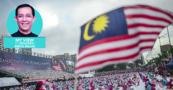
At one point our sovereign insignias: Jalur Gemilang, Negaraku and the national emblem with the motto "Bersekutu Bertambah Mutu" (remember?), were more than ample to give the very meaning we are seeking for without the aid of any fashionable logo. The latter tendency suggests that the sovereign symbols are "weakening" and need to be propped up despite inherently being all about 1Malaysia sehati sejiwa – to use the cliché.
Could it be that the "confusion" is in the "mind", which needs fine-tuning rather than the logo? It may well be given the many "new" normals emerging that are clouding what was once crystal clear. Still the potentially "confusing" logo has been in the public domain since 2009, long enough without any hint that it is "problematic". Credible evidence to prove otherwise is also wanting.
Over the last two decades many logos have been introduced that still beg similar questions. They are generally short-lived, have an uncertain impact and cost aplenty.
Let us start with the Rakan Muda programme unveiled in 1994 with a myriad of logos touted to change the youthful lifestyles to something positive. Calibrating this with the general state of affairs today, involving our youth in particular, it raises doubts as to its effectiveness. Now that those logos have virtually disappeared, does it mean that they are firmly internalised such that their display is redundant? Or have they failed as indicated by the worrying trend among youth? What impact has the Rakan Muda programmes brought to renew our thinking today? Despite claims that the programme had been relaunched in 2008, the situation remains dire.
A case in point, there is nothing more dire than the addictive smoking habit among our youth. Dubbed as a gateway to the use of hard drugs, smoking has worsened over the years. This is despite an earnest effort to counter this trend through a RM100 million anti-smoking campaign between 2004 and 2009 with another corporate designed logo to boot. Known as Tak Nak, the campaign was reportedly deemed a "failure" by the then minister of health. The slogan reappeared more recently with its logo tweaked. But failed again in face of the "vaping" onslaught that took the smoker's world by storm.
It is apparent that the logo has little impact to drastically check, if not, reduce tobacco abuse, especially among the younger age group.
Extrapolate these miseries to the purported logo relaunch, the storyline and outcomes are similar indicating that the inherent failures in thinking are still there. Hence having to tweak the logo raised more questions than answers. Juxtaposed against the money spent, it is tempting to ask what have we learnt from Tak Nak and Rakan Muda, especially when there are other (cheaper, more effective) options widely available but not duly explored.
Can the "confusion" be addressed through a more robust realignment (think Rukun Negara) so as not to redo the logo. Particularly when all the elements in the old and new versions are the same – the flag, the figure 1 and the words "Malaysia" and "Negaraku" at the base of the figure 1.
There will be monumental savings if the logo is not redesigned, hence making further savings since the old logo is kept in use. Otherwise, imagine just the amount of promotional stationery that would go to waste or had to be reworked. The magnitude is daunting relative to diminishing resource allocations.
Even in the worst case scenario, if a new logo is deemed absolutely vital, why not opt for an open competition for all Malaysians. The new logo – "blending" values of inclusiveness and unity – cannot be better served and demonstrated through a nationwide participation that captures exactly the desired outcomes of inclusiveness and unity instantly.
Unfortunately, all these are now academic since another regular logo has been dished out. This time with a subliminal message on the lack of prudence and participation. Whereas it could have provided wider latitude for inclusiveness to work better through a greater sense of sharing in forging unity.
Sadly the golden opportunity to showcase just that was myopically missed, in preference of the "old fashioned" ways prone to rather dismal results which were proven wasteful. All these are subtly subsumed by the new, rather dull-looking logo.
Moving forward, it is better to return to the established sovereign insignias, at once eliminating the redundant need for more logos. And be prudent in public spending.
